
Good buildings are not imposed on a place. They emerge from it.
Year
2026
Client
Croft
Services
Brand Identity
Art Direction
Design
Web Development
WEBSITE
Melbourne's development market runs on borrowed language, where every project is premium, every address coveted, every render aspirational, and buyers making one of their largest commitments have learned to distrust the volume.
Croft, a practice with a heritage restoration background, needed a brand that signalled stewardship rather than salesmanship. The frame was material honesty: a developer that speaks from evidence, not promise.
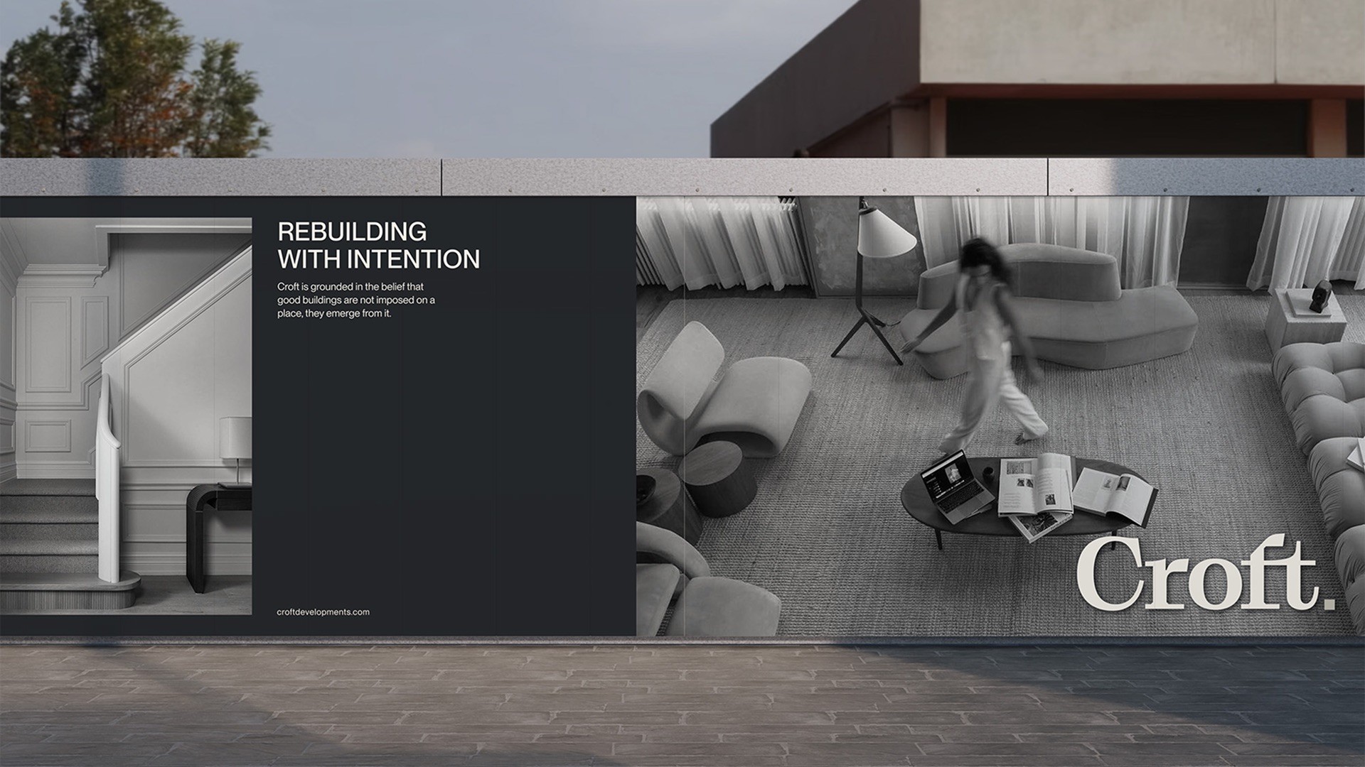
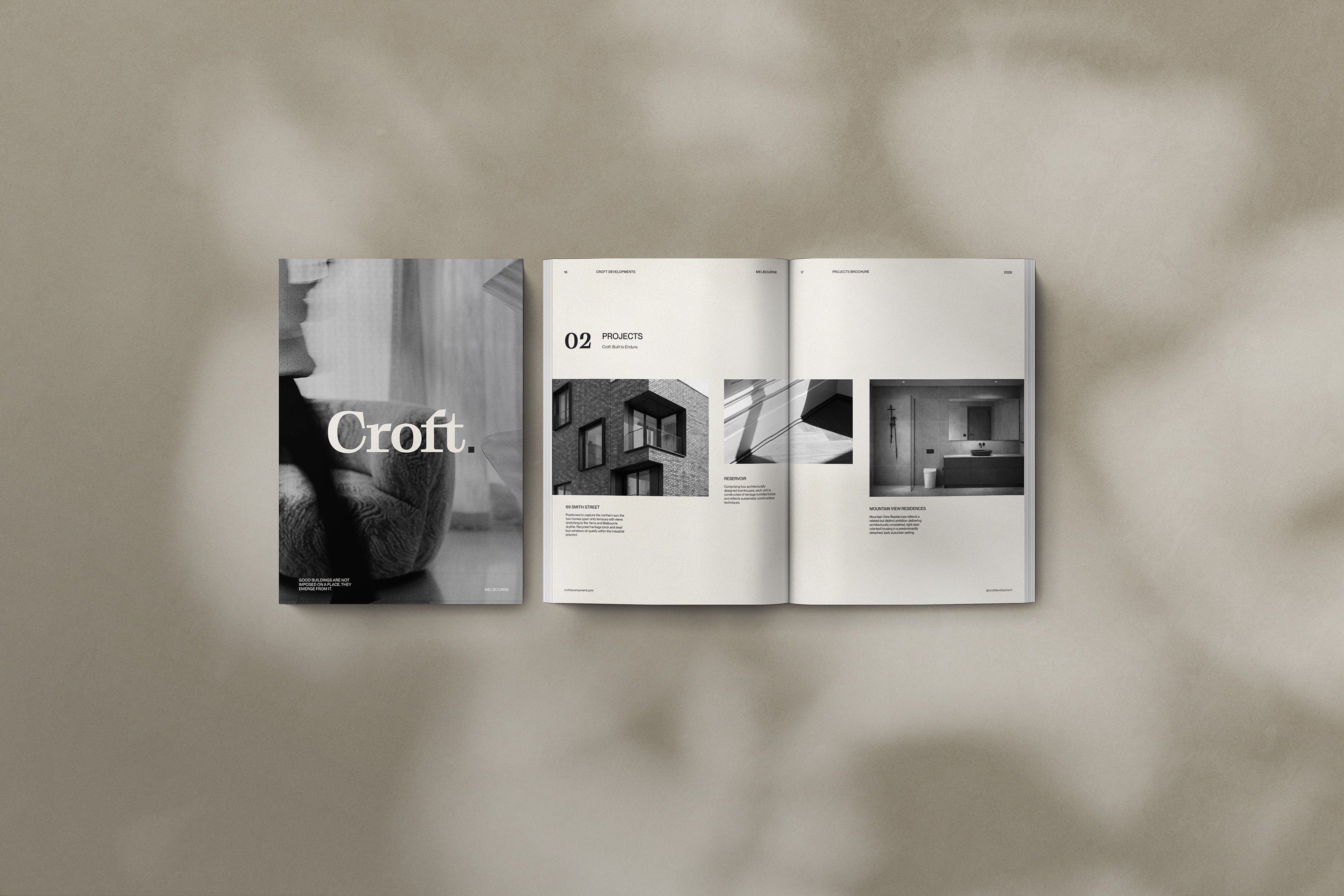
A refined display serif wordmark, closed with a deliberate full stop, sits against a mineral palette of linen, stone, and charcoal; black-and-white photography strips images to form and light; the voice trades superlatives for bluestone, timber, render. Copy leads with place, never the developer.
Across hoarding, brochure, website, and stationery, restraint became the credibility signal: a development brand that reads as architecture, not marketing.




Back